Total Pageviews

Saturday 29 January 2011

Exercise - Image development

Object of exercise - to take an image with a range of content and then crop it in ten different ways, Note if the images have more drama by the way they have been cropped. Choose a word for each image that relates in some way to the content, but this may contradict the image or show an alternative interpretation.


Original Pic


I decided to work on the image with the young egyptian camel guide/handler or whatever the correct terminology should be, but use the word 'Youth' instead of 'Teenager'. I think the word and the image
go well together but also offers an element of contradiction to the usual image of a typical 'Youth'.
I wanted to create a poster by using Photoshop as opposed to a drawing or painting as I liked
the slightly grainy quality of the photograph and the mood of the shot.

Preferred image with new word

This looks better with the lettering but
still not dramatic enough. More
work needed.
More to follow.

Exercise - Reading an image


The image depicts a cavern/cave which appears to contain a sleeping dragon, which seems to be guarding a pile of golden treasure and a throne. Discarded armour and weapons litter the floor, perhaps at one time belonging to previous trespassers, who were unsuccessful in their attempts to steal the treasure or slay the dragon. In the mouth of the cave are two young adventurers, one of which is carrying a flaming torch which is illuminating the walls of the cave. The suggested narrative is that these two have ventured into the cave to kill the dragon and win the treasure trove.
The colour pallette consists of bright red which illuminates the dragon and this is also used along with yellow and orange to suggest in an abstract way the walls of the cave. Complimentary colours of purple and blue give depth and tone to the shadows and the light blue and green give a feeling of coldness to the ground and entrance. The hottest colour is the red, drawing your eye to the dominant character in this scene, the dragon, and the red and orange of the torch leads your eyes to the two figures. These two figures are noticably smaller than the sleeping giant, giving a feeling of the enormity of their task.
The use of texture in the blue floor and the jagged purple entrance of the cave, along with the way the glow of the torch has been depicted to suggest the rough walls of the cave.
The use of red seems an obvious choice for a fire-breathing dragon and the composition of the picture and connecting complimentary colours lead the eye around the scene in a circular route.

Friday 28 January 2011

Exercise - Illustrating visual space

For this exercise we had to source a black and white image of a running child, a tree and a building and using them in differing scales, arrange them to create a representational image.
A horizon line is to be added to separate the ground from the sky, and to create an illusion of space and distance. Then answer the following questions;
How does the sense of the image and its meaning change when the figure is smaller than the other elements?
If the elements are at differing angles to each other and at an angle to the frame, what dynamic is suggested?
If all the elements are completely horizontal and vertical in relation to the frame what dynamic is suggested? What is your opinion about this image and what sensation does it communicate?
Which is your favourite composition - explain why.

In this image the child dominates the scene, whilst the horizon
and size of the house suggests greater distance in the foreground.

Subtle change in the horizon brings the house nearer
and the tree seems further away. The girl still dominates
the scene.

Now that the girl is smaller than the other elements she
seems to appear more fragile within the scene and this
evokes a feeling of danger or panic in this instance.

Horizon line change again introduces more sky into
the image and a heightened feeling of space.

Bringing the house forward, enlarging it and making the
girl even smaller lends a feeling of space to the back of
the picture and an increased feeling of distance to the
horizon.  Note now the sinister house dominates.
Dont go in!

The girl now seems more connected to the house but
appears to be running towards the distant tree. Big
sky and space makes the picture less sinister
but the eye seems to lead towards
 the tree.

The house dominates this scene but the angles
lend a quirkiness to the image, whilst still slightly
sinister. Now each element leans in to each other,
seeming to connect. The eye seems to follow a
circular route around the picture.
It seems that a sense of uniformity and order are prevalent when all the verticals and horizontals relate
to the frame,  and this lends to a strong composition, but when elements are pictured at an angle the whole mood of the picture changes. Even though the angled house is not neccessarily realistic in composition, it lends a feeling of drama movement and chaos to the scene. For this reason my favourite image is the last one with the leaning house.

Sunday 23 January 2011

Assign 2 - Point of sale cont autumn.


Autumnal moodboard
Decided to try a different tack and do some watercolours of the fruit and chillies. Then sprinkled some
Photoshop fairy dust on it and voila, this is my summer point of display. Despite differing opinion I'm positive
that oranges are a summer fruit. I tried the three shades and felt the sky blue worked best as a contrast to the orange and gave a feeling of light, airiness if there is a such a word... Still liked the green and orange though.


Peel off for Summer

Shades of Summer Orange.

Who needs Lemons...


Then there is the Chilli...I have decided after much consternation that the chilli could be a summer and an autumn fruit/veg? So therefore I have produced a green shade for autumn, and the blue for summer. I'm quite pleased with these boards as they work together with the orange and compliment each other.
They might even work as some sort of food-based greeting card!


Summer Point of Sale

Autumn Point of Sale

  Finally, I had a go at an apple watercolour and then followed the same process as above, which by the way does not really involve fairy-dust, but hours of frustrating slog on the lap-top involving cut-outs, layers, paths, etc etc before finally reaching this point. Same area of self questioning regarding the true domain of the apple..., is it summer, or is it autumn? Well I eventually opted for autumn and came up with this.


Autumn Point of sale


Enhanced by Zemanta

Friday 7 January 2011

Goa

In December we went to Goa on Holiday and whilst there did the 'Golden Triangle' for five days,before returning to Goa for a week on the beach. Goa was great and without wanting to sound dramatic, India was intense. Difficult to describe, impossible to understand, the place is great and I shall return.
Below are some of the sketches from my trip.

Quote from Holy Cow by Sarah Macdonald - just sums it up.


Enhanced by Zemanta

Monday 3 January 2011

Assign 2 - Point of sale cont.


The mood boards I created really helped to give a sense of the 'feel' and mood I needed to convey in my piece of advertising, and one of the main things that struck me was the importance of using the right colours and shades in the illustrations.The need to attract attention to the fruit on sale, meant using bright primary colours, clean uncluttered images and simple messages that gave an instant impact.


I then worked on a number of rough sketches along the lines of the summer fruits, as a starting point. I was thinking initally of a simple line drawing, with a watercolour wash adding the colour or just bright symbolic shapes and colour to define the particular fruit.


I then had the idea of scanning the line drawings into Illustrator and then colouring them in using bright, vivid colours that were already associated with the fruits through both name and appearance. I also thought that this could be a good angle to use for the whole campaign - big single type/ words describing the fruit on offer in the simplest of terms. Less is more, keep it simple like traffic lights...
Here are a couple of ideas along this theme to illustrate;

I like the way this works, big, bold and simple.
It does what it says on the tin...
The Future is Orange...


Same theme but not as strong as the Orange. It needs
a stronger drawing and less colours, maybe just green and yellow.
Stencil font works well though..
pencil sketch of a lovely pear.
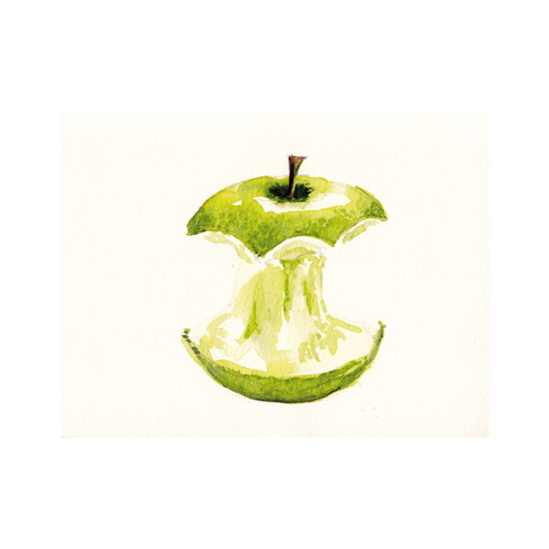
Watercolour sketch
Watercolour sketch
Watercolour sketch
 I quite like these watercolour sketches and think I will work on them in Photoshop to create a background in suitable colour. Not sure which season suits best for each but will decide on that later...
This works as an illustration but not too
happy with the colours yet..


 More to follow;

Assignment 2 - Point of sale display

The Brief
To create images which will be used in a campaign for a supermarket, to package and promote a range of
seasonal fruits. The notion of quality must be evident in the design and packaging.
The finished images will be a point of sale display sited near to the fruit and veg. The final reproduction size
will be 12 x 12 inches.

To start off this exercise I worked on Summer first and did some research into summer colours and the shades that would work to convey the feel of the season. I then producd a couple of mood boards to help
generate ideas and set the tone for the exercise.

Summer colours
  
Enhanced by Zemanta


Inspirations