Total Pageviews

Monday 28 February 2011

Exercise Viewpoint

Make a collection of objects around a theme - I have chosen  'The Morning After' and for this I raided our glass recycling box and gathered a wide variety of empties teamed up with a few half-empties, arranged in a 'non-arranged' format. I then shot them from a variety of angles, zooming in and out and looking for different angles and crops that illustrate my interpretation of the title.


After shooting the bottles on the worktop I was returning the empties to the bin
I realised they looked a lot better lying there, randomly positioned where they fell.


Enhanced by Zemanta
I like this image best, zoomed in tight and
cropped so that the edges all cut through
the diagonals....I think...
The next stage is to do the same thing through the ancient art of drawing, changing the crops, and viewpoints in the form of thumbnail sketches.
I tried to explore the photographs from different views, changing the framing and the format so that the image encompassed the feeling of 'The Morning After'.

Thumbnail sketches 1

Thumbnail sketches 2

Favoured final sketch.

This was my favourite image of the selection of thumbnails I did. I like the viewpoint from above which to me felt more interesting as a subject. The irregular format adds drama to the image giving a feeling of mess and chaos which often accomapanies that 'morning after' feeling.
Changing the viewpoints, especially in the thumbnail sketches really helped me to focus on the exercise and gave a good idea of what the final artwork could achieve.

Monday 14 February 2011

Illustrator - Geoff Grandfield


Geoff Grandfield montage


Marlene Dumas

At the suggestion of my tutor, I had a look at the work of Marlene Dumas and I thought I would share it with you.
Born in South Africa in 1953 she now lives and works in Amsterdam, Dumas uses the human figure as a means to to critique contemporary ideas of racial, sexual, and social identity. The very rawness, tone and subject matter reminds me of the work of Lucien Freud and Jenny Saville but with a much looser more expressionist style.


Blue Marilyn

Supermodel


Young Boys

Bronze Meryl

The Stripper

Enhanced by Zemanta

Tuesday 8 February 2011

Exercise - Giving instructions.

Below are some of the examples of reference showing instructional diagrams or illustrations on how to perform different tasks;


I like the format of the Esquire illustration above, with the simple square diagram and paragraph of copy
explaining the process below each square, but for my illustration I would like a more 'circular' shape to the
drawing overall which will lead the eye on a natural route from start to finish. I have started by writing a basic list of instructions which will give me an idea of how many 'stations' I will require to complete the illustration. This reveals that I will need six. I have the idea initially of basing all the diagrams around a large tea cup in the middle and sketched this out - see below.

I quite like this version but think it looks a little messy and disorganised around the edges, so have refined it a bit by trying to combine the large cup in the centre, but this time encapsulating the surrounding diagrams in their own boxes. see below.


I think the squares around the tea cup version above is working well, and have introduced little arched arrows, making the journey more obvious, losing the numbers, and I think this also adds to the 'circular route' feel I was looking for. I have also sketched out a rough above showing a square format which has a very simplified look to it. The numbers are back in with copy that will sit in the corner of each diagram. I was thinking in terms of a black and white line drawing maybe, with the number and copy lines in red?


I then did some pen and ink drawings of the milk jug, cup and tea-pot and then scanned them into Illustrator and live traced them to be used in the final piece. Being mindful of the hierarchy of the image I decided to increase the size of the image boxes as the viewer is led around the drawing, and I also introduced some colour into the final teapot and cup as a central point of focus (see below).
I'm quite pleased with the final  image below, and having shown it to a few people have had positive feedback. 'Could have included teaspoon with sugar', was one comment but I personally think this would have made the design too 'busy'.
As an afterthought I would have liked to have added a pale colour in the background but due to my limited skills in Indesign, finding this very difficult to 'just change'. I really need to nail my digital techniques as I am  taking too long to do what should be fairly simple tasks. Need to consult my Illustrator 'guru' for more lessons...

Saturday 5 February 2011

Exercise - Abstract Illustration.

Task - Listen to a piece of music by Miles Davis and as you listen to the music, create marks to illustrate your interpretation of the essence or mood of the piece.

I chose the Miles Davis track 'All Blues' from his album, 'A Kind of Blue' and just listened to the music, whilst making marks, patterns and squiggles that  I felt represented the mood and feel of the track. I intended to start with a pen drawing, and then add colour and alterations in Illustrator.
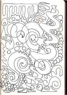
Penterpretation 1


Its difficult as you sit there with your pen, trying to 'draw' the music or mood, but I suppose I'm comforted by the fact that there is no wrong or right answer. Its just my interpretation. After looking at my first efforts several adjectives came to mind such as swirling, spiralling, rounded, spiky, smooth, but I think the one that suits the piece best is 'spiralling' in the way the music seems to peak and subside.


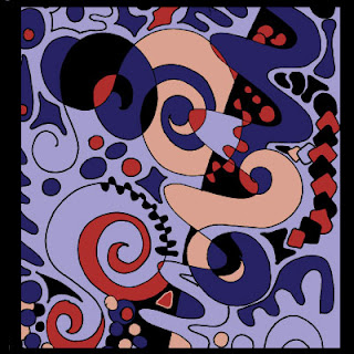
Penterpretation 1 coloured in Illustrator


It seems obvious to choose blue as the predominant colour for this image, but it suits the piece and reflects the cool, smooth feel in its neutrality, with the darker red offering contrast and the blacks emphasising the peaks and shadows, and  giving a sense of depth.
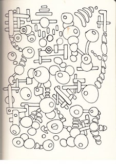

Penterpretation 2

This is my second, and very different sketch which I intend to visually adjust in Illustrator. I dont think the drawing really does such a good job as the first effort but there are elements which work.


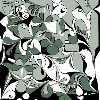
Illustratored Penterpretation 2


 As you can see, the digitally adjusted image above bears little resemlance to the scanned image 2, but once I started to distort the marks I had made, whilst at the same time listening to the track, it seemed to evolve and the actual process of 'warping' and distorting the existing marks seems to suit the task. I kept the colours cool and reserved and feel this one captures the mood.


I decided to go the dgital route, by drawing in Illustrator and then manipulating the basic image and I feel these are more successful. I think I have improved on the one above by toning down the colours in the one below to give a cooler more mellow feel.


Enhanced by Zemanta
I have also introduced some graduated tints into this one, along wth more subtle use of black.


Simply by increasing the stroke of the black line has given the image above more definition and changed the
mood of the pic quite dramatically. It feels stronger.


Another different approach which I feel offers a representation of the track, just trying to
show another avenue.


Spiralling seems to suit this image pretty well but I am pretty happy with all the Illustrator images. They are all quite different but each version has its merits. I think they could all be used for a cd cover, but then i would, wouldn't I?

Wednesday 2 February 2011

Exercise - Image development - final image.

I decided to improve on my previous efforts by adding some texture in the shape of a 'sack-cloth' material which I blended into the background. I thought the colour and texture of this really went well with the photograph, especially with the grainy quality of the image. I then added some colour and more texture with the striping and then finished off with the text.. The last task was to make his face more visible wth the use of the old magic eraser, (it really was'nt as easy as I am making this sound, for me at least), and envolves many hours of frustration but without wishing to sound smug, I'm quite pleased with the result.

Finished image.