Total Pageviews

Sunday 29 May 2011

Illustration Friday - 'Asleep'

'Archie'.

Archie - 'Banksy' style.

Wednesday 25 May 2011

Tutor feedback - via Skype!

Just a quick note to say I've just had my first Skype feedback session with my tutor Christian Lloyd and I have to say, it was really good. The chance to talk 'face-to-face' is excellent and gives you the opportunity to get a better understanding of your tutor's comments.
After a really informative chat I feel really motivated and ready to tackle the next set of work, with plenty of food  for thought to help me along the way!

Sunday 22 May 2011

Exercise - Museum posters 3

To create a poster for an adult audience could in some ways be quite difficult as people's tastes are so diverse. Some of the ideas I collected for the teenagers could be suitable for some of the younger minded adults. I started with a spidergram and some ideas of what the museum has to offer for the average adult and came up with the following;

Local history - natural histrory - world history - local collections - art - ceramics - travelling exhibitions - art - societies - classes and workshops - educational reference - meeting place - coffee shop - chilrens facilities. 


I then produced a mood-board as below.


The main exhibition at the New Walk museum is the Egyptian section so I have decided to go for the same subject as the teens, but this time produce something a little more sophisticated. I have included in my mood-board a number of posters that I find interesting and thought-provoking.


I really like this poster for the V&A Museum exhibition of posters. Its strong, stylish and the kind of thing I would like on my wall. Its simple but 'does what it says on the tin' and gets the message across, loud and clear. This is the sort of thing I would like to do for my poster, limited colour pallette, simples...


Another great example. Great use of metaphor, with the inner-child in everyone finding something they can relate to in this poster. Note the colour range is not loud or too vibrant, but the colours contrast well.

Rough idea for Egypt poster.
I have tried out a few ideas on the subject of Egypt, primarily using digital and the one above is the best of the bunch. I wanted to keep it clean and punchy, which I think I have achieved to a certain extent, but not sure about the colour....looks a bit too muted.

Coming back to this, I have been thinking about concentrating on the Dinosaur theme and decided to simplify
things and have been tossing the idea of  'Walking with Dinosaurs' as a nice tagline, so did a sketch below, showing just part of the skeleton walking out of the frame, see below.

Sketch 1
I then scanned this in and traced it, adding colour to produce the following;

Digi-sketch 2
Step 3 was to add  the title, which I changed to 'Do the Walk..' as below.

Version 1.
For the final version I changed the colour completely as I thought it would stand out more and then messed around with the text by curving the tag-line.


Final Version.

Wednesday 18 May 2011

Exercise - Museum posters 2

This section is aimed at Teenagers aged 13-16, so I have based the mood board on similar images, but in the dinosaurs are a little more scary, or 'edgy'. I have also included some shots of the Egyptian mummy, which I thought would be of interest to your average teen with its associations with horror films and the like.
 The museum has a display on showing the use of the mummy in contemporary films and to take this further I had the idea of a  graphic image of the mummy in the style of the Turtle illustration below, maybe in the format of a movie poster.
 I liked the graffitti-style text which I thought was relevant but maybe on the negative side would be difficult to read for most.

I also tried a spider-gram to look at reasons why young people might find the museum of interest and came up with the following thoughts;

Informal learning, Exploration, History, Travel, Egypt, mummies, monsters, horror films, treasure and adventure, Interactive displays, Scary stuff,  Graphic images, Cool art, retro, modern culture, coffee shop, meeting place, internet & web sites.

The poster needs to be bright and colourful to attract attention, but still needs to look 'cool' and the kind of thing your average teen would have on his wall.

image from museum


Hand sketch from museum image
illustrator image from death mask

After sketching out a few ideas I went onto Illustrator and Photoshop and combined them to create the poster below. I used a photograph from an Egypt trip containing hieroglyphics which I thought worked well with the modern graffitti as it could be seen as a form of ancient grafitti. I then added in the mummy for a spice of drama. I need to work on the typeface at the bottom of the poster as there is not enough contrast with the background and is difficult to read...

Teen poster visual

Sunday 15 May 2011

Exercise - Museum posters


New Walk Museum, Leicester
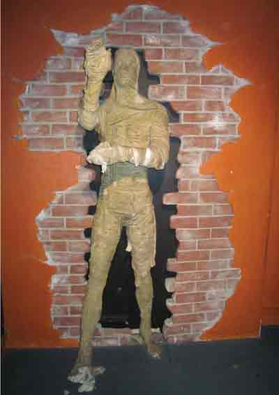
Image by Ned Trifle via Flickr
To produce three illustrations to be used as a part of a series of A3 posters to publicise the museum to the following audiences;
Child aged 5-9
Teenager (13-16)
General Adult audience

To start me off with this exercise I visited the New Walk Museum in Leicester and took some pics of signs, artefacts and things that I thought in some way represented the museum. I also researched in books and the web all images I could find on the subjects of dinosaurs and Egypt, which happen to be featured at the museum.
I made a list or spidergram of all the things that I thought would appeal to a Child of 5-9 years that were on show there as follows;

Creepy Crawlies, Natural History, Exploring, Pets, animals, Dinosaurs, Monsters, Mummies, legends, Kings and Queens, dressing up, Knights, weapons, toys,
fairy tales, Games, workshops, play and art. 

I tried to put myself in the childs place  and think of what it was that excited me whenever I visited the museum as a child and the dinosaurs and mummies always held a fascination from what I can remember, as well as a sort of fear.

I then did a mood board, using the images I had collected to give me a feel for what I was hoping to achieve.


moodboard for childs poster

My only concern at this stage which has surfaced whilst looking at the moodboard is the percieved ferociousness of the dinosaurs, and how children would react to this? Maybe its a good idea to make the dinosaur a 'character' such as 'Barney' which would appeal to young children and could be used in a visual form within the museum in the guise of a guide on posters and notices etc.


I really like this simple, childlike lettering. Bright primary colours, which look like they are cut out of foam and stuck on the fridge would look good on a poster and shout FUN!. I am thinking of creating letters using 'bones' to go with the dinosaur theme and would like to achieve the same feel as the letters above

sketchbook ideas for child poster 1
sketchbook ideas 2

In sketchbook ideas 2 I have tried to make the dinosaur more 'child-friendly' so as not to terrify him too much! I have taken the 'bone-type' idea from sketch 1 and coloured it in - see below in sketch 3, which I think works pretty well...

sketch 3 dino-font.
This 'dino-font' will work well for children, but the only downside is that maybe it will not fit in so well with the other posters? We will have to see how it pans out, but now need to decide on a final design for the image to be used on the poster.

Above is the rough visual for the childrens poster. I worked on the idea of simplifying the dinosaur up to the point that he became a very simple shape, but one that was instantly recognisable. I think this could work well on a number of levels, such as merchandising and brand identity and could be used throughout the museum as easy child-friendly signage.


Enhanced by Zemanta